I help spvie assurance optimize its subscription product process by deep user studies
OVERVIEW
I planned and led a complete user interface optimization on one of Spvie Assurance's main products. I was lucky enough to have the full support of the marketing director for this project, which enabled me to set up several workshops to analyze real-life users.
4,5
months
INSURANCE
remote/ON SITE
TIMELINE
Discover
8 weeks
Stakeholders interview Satisfaction Survey KPI Audit Research Benchmark Persona
Workshops
4 weeks
Plannification User Recruitment Reward system Observation Experience Map
Design
1.5 weeks
Wireframing Prototyping User Testing
Deliver
4 weeks
Workshop Result analysis Full Report UX solutions Technical solutions
Stakeholder interview
I discussed with stakeholders to clearly identify actuals implications & breakpoints regarding each actors involved intro the product.
CEO
Director Associate
Marketing Director
Product Owner
UI Designer
What specific problems are you currently experiencing with the product?
What specific features would you like to see added or improved in the product?
How do you see the application fitting into your overall business strategy and objectives?
What budget and level of involvement can we allocate internally to carry out this UX optimization?
majors Problems i identified
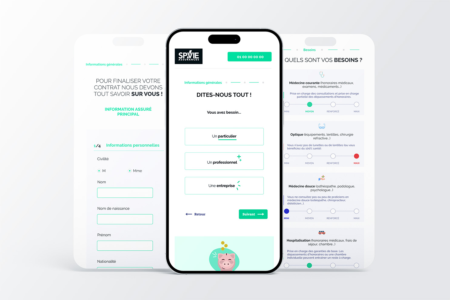
UI | Optimization of timeline and pricing stage
DEV | Optimize maintainability/regression and error message display
STRATEGY | Emphasize personalized offers. Offer a price consistent with customer needs.
workshops
35
total users
30 spvie clients
5 spvie employees
8 weeks Animator: Vincent biabiany Observator: 2 spvie employees
W1
Matrix priorisation
Gather the vision of stakeholders by listing the frustration points known on the “Designer” side, and prioritize these to define the UX project objectives.
W2
Observation
Gather user data through real-life observations. Understand users' frustrations when navigating the subscription path.
W3
experience map
Chronologically represent policyholders' experiences during the Observation workshop, to identify critical moments in the experience.
solutions i offered
Simplified microcopy
Observation
In the “pricing” stage of the journey, the originality of the offer names is confusing for users.
Solution
Rework offer names. Remove acronyms that are unfamiliar to the general public (IJH) or provide an explanation with a tooltip on mouseover.
Offers details
Observation
A display system that has proved very popular with our customers. However, the link to trigger it is not very visible.
Solution
Offer a display system with the details of each offer natively open upon arrival on the page. The trigger link can be removed.
Ergonomics and structures
Observation
Most customers are accustomed to the information density of this type of course, and will therefore naturally carry it out on a desktop computer rather than on a cell phone. The space available on a large screen can then be better utilized.
Solution
Propose a coherent and intuitive zoning for the user by separating the so-called informative zones (offer details) from the so-called action zones (Modify my budget, modify my needs... etc).
This solution also offers flexibility when it comes to adding future functionalities at this stage.
outcomes
8 months after creation
+12
net promoter score
2 points above the 2024 industry average, signaling best-in-class loyalty improvements.
90%
Form completion rate
In progress but still below the industry norm. (+7%)
145
SUBSCRIPTIONS per month
A steady month-over-month rise (+23 % from January to April)